- Date
- mercredi 22 mai 2024
Your guide to interpreting meteograms and integrating them into your planning process.
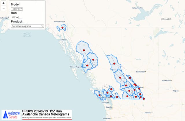
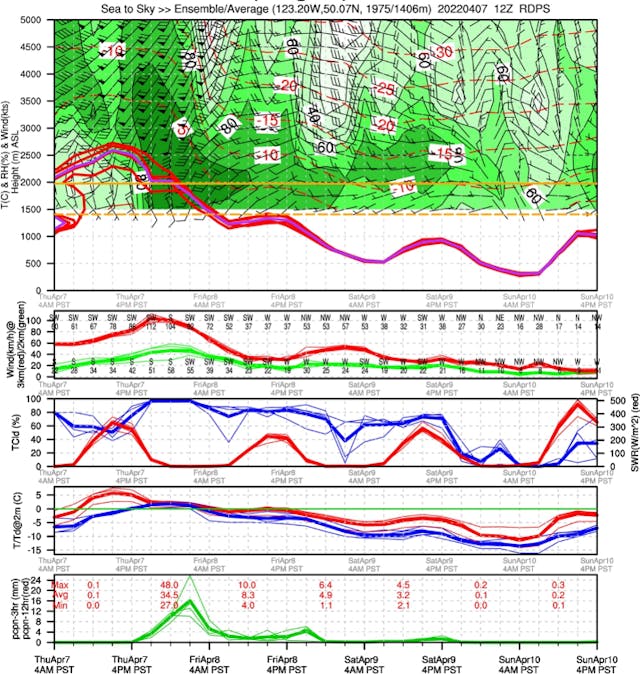
Meteograms are weather forecast diagrams created by Environment and Climate Change Canada (ECCC). As public avalanche forecasters, we use these on a daily basis as part of our forecasting workflow. They are a highly valuable and freely available resource that you too can incorporate into your daily process. You can find them on our website in the weather section.
Although they can seem overwhelming, but once you learn how to read them, they're full of helpful information.
The Basics
Model
There are three choices of model you can use in your meteograms, which you can select using the drop down on the top left of the screen. They are the HRDPS, RDPS, and GDPS. We use each model for slightly different purposes.
HRDPS (High Resolution Deterministic Prediction System)
This is a short-range and high-resolution model. It gives a prediction for 48 hours in the future across a 2.5 km square area. Usually, this model is the most accurate for short-term weather forecasting and often best reflects the mountain environment.
RDPS (Regional Deterministic Prediction System)
This is a medium-range and mid-resolution model. It predicts 84 hours into the future for a 10 km square area. This model doesn't account as well for mountainous terrain, but it is very helpful for spotting trends in the weather forecasts.
GDPS (Global Deterministic Prediction System)
This is a long-range and low-resolution model. It predicts 10 days into the future for a 15 km square area. Due to the long term nature of this forecast, it may be less accurate in the short-term. We mainly use this for long-term planning.
Run
The meteograms are issued 4 times a day. They use Zulu time, which is a standardized time zone. For our purposes, we don't need to worry too much about Zulu time—we're just going to use the most recent one.
Product
We can choose between point meteograms or group meteograms. Point meteograms provide a forecast for one specific location and group meteograms summarize the information for a wider region and forecasts based on that.
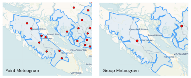
A group meteogram can help us to understand the regional extent of the weather, pick out trends, or find hot spots for snowfall, wind, temperatures, etc. A point meteogram is going to zoom in on one specific area and give you an idea of the weather forecast for that particular area.
There are also (SNL/PT) versions of point and group meteograms that provide additional information about snow level and precipitation type. While this can be useful, the additional information sometimes makes it more difficult to see trends.
In the below example, the red lines show the freezing level and the blue line shows the expected snow line. Typically, we expect the rain-snow line to be 100 m below this line for weak precipitation and up to 300 m below during strong storms. The panels in this type of meteogram also gives you the precipitation types:
- cvctP - convective precipitation
- RA -rain
- SN - snow
- ZR - freezing rain
- PL - ice pellets

Interpreting Meteograms
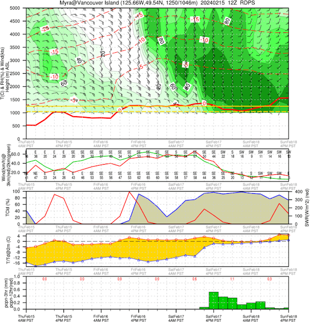
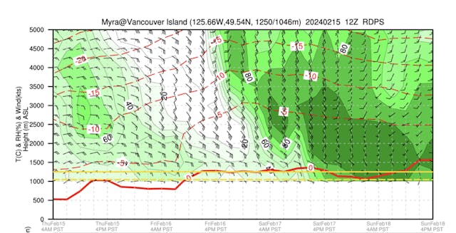
At first glance, this is a lot of information to process in one diagram! Let's break it down and start with the top panels.
Heading
This will tell you the location, with GPS coordinates, typical treeline elevation for that area, and the model grid point elevation. It will also give you the date and the model run.
Shading
The green shading is telling us the relative humidity at different elevations. Dark green means high relative humidity, white is low. The black lines are humidity contours. As a rough rule of thumb, 80% relative humidity means it will be cloudy, 100% means precipitation, and the white areas suggest clear skies.
Wind Barbs
The chart also tells us about expected winds. The black wind barbs show the wind speed and direction at different elevations.
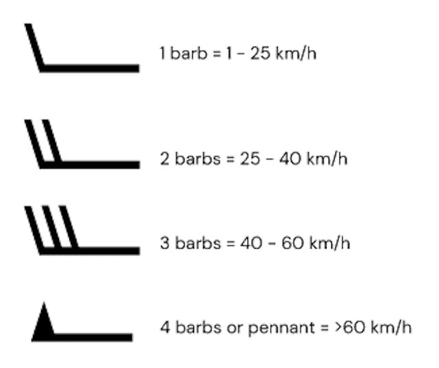
The barbs point in the direction the wind is expected to come from. You can also use the next panel down to learn about wind speeds at 2,000 m and 3,000 m elevations. The top panel is usually more accurate for learning about wind where you will be recreating though.
Air Temperature
The dashed red lines show the air temperature at different elevations (shown on the vertical access).
Treeline
The solid yellow line indicates the typical treeline elevation in that area. The dashed yellow line is the model grid point elevation, this means there is no data below that elevation.
Freezing Level
The bold red line indicates the freezing level.
Cloud Cover
Let's skip down to the cloud cover panel.

The blue line here shows the percentage of cloud cover. You can use his with the relative humidity data to get an idea of cloud heights and layers.
The red line is shortwave radiation. This basically means how strong the sun is expected to be. We measure this in watts per meter squared. The influence this will have on the snowpack depend so on the surface snow conditions, but we generally consider anything more than 400 W/m as likely to have a strong impact on sun-exposed slopes.
Temperature

The next panel gives us information about the air temperature. Although this information shows us the difference between the air temperature (red line) and the dew point (blue), most meteograms are too low to be helpful for mountain forecasting. Often the first panel is more helpful for our planning.
Precipitation

This panel gives us the 12 hours QPF (qualitative precipitation forecast). It tells us how much snow or rain we're expecting and we measure it in millimetres. The red numbers show minimum, average, and maximum QPF for the 12-hour period between 4 AM to 4 PM (or 6Z and 18Z!) and 4 PM to 4 AM.
When we're dealing with snow, the amount of precipitation doesn't always result in a uniform amount of snow. To work out how much snow to expect from each millimetre of precipitation, we use the snow to liquid ratio (SLR). SLR is linked to temperature, colder air tends to produce higher SLR (15:1 or 20:1) and give us lighter, fluffy powder snow. Warmer temperatures usually mean a lower SLR (7:1 or 5:1) and denser snow, which is excellent for making snowballs.
Conclusion
I consider the world of weather forecasting to be a bit of a dark art. Meteorologists are literally trying to pin down a moving target to determine the exact track, timing, and intensity of a frontal system. It's essential that you verify the weather conditions in the field, in the same way that you are verifying the snowpack, because the two are very deeply related.
There are so many fascinating things to learn about the complex and dynamic phenomenon of mountain weather. In the winter, reading the Mountain Weather Forecast on a daily basis is the perfect place to start to build a foundational knowledge of weather and start your trip planning on the right foot. There are many other freely available resources that can help in your knowledge and trip planning, here are a list of some of my favorites:
- ARFI- Designed to help private and public avalanche forecasters, guides, and recreationalists. ARFI was developed by the Applied Snow and Avalanche Research Group at the University of Calgary (ASARC). Around 2014, the ownership of ARFI was transferred to Avalanche Canada.
- VizaWeb- The site is awkward and cumbersome to use but provided a great visual of precipitation hotspots. This is I would generally set up the viewer to look at total precipitation accumulation.
- The GFA- The GFA (Graphical Forecast Area) Is produced primarily for pilots by NavCanada.Learning the different symbols and and abbreviations takes some time, but can help with your analysis of visibility/cloud cover, wind and precipitation.
- SpotWx- Designed as a spot weather forecasting tool. It offers a variety of weather models and offers data insimilar charts as the meteograms, but without the visual top panel. I usually look at SpotWx to compare models. If there is a lot of model disagreement in the weather forecast I may factor that uncertainty into my trip plan.
- Canada RASP- This site was created by a paraglider and provides two visualizations from the HRDPS model. One is a map that primarily shows information about wind at different elevations, and the other is a ‘windgram’ which shows wind and temperature at a single location as a function of altitude over the next one or two days. This windgram also shows atmospheric stability, which can give an indication of enhanced or convective precipitation (especially in the spring!)